@th I'm not sure it passes the test for some colorblindnesses, though.
But I think the general UI would greatly benefit from this.
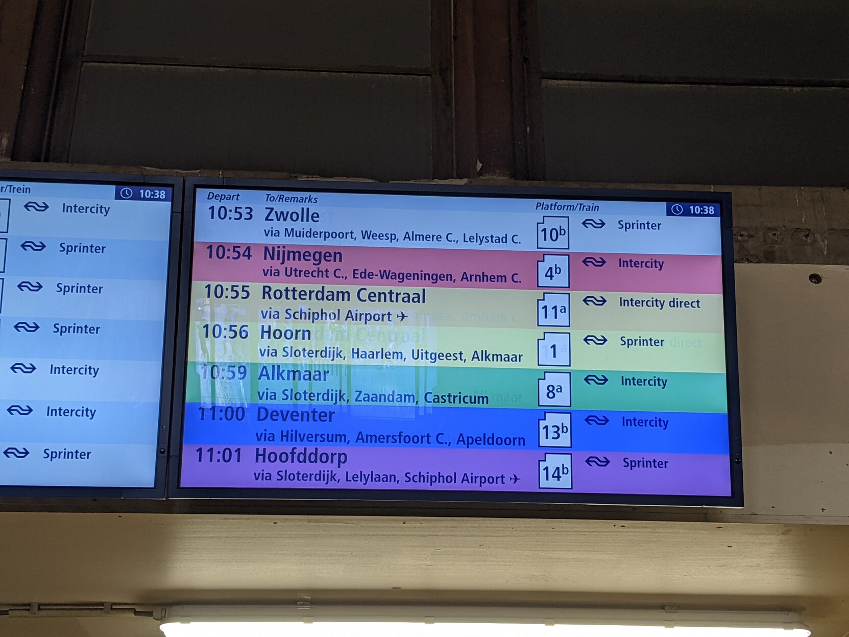
Timetables now always shift up when trains depart, causing me to hunt the entry (for e.g. Nijmegen) around. It would be a great improvement if e.g. "Nijmegen" always gets the color "red" and I can just glance to find "red" around.
It wouldn't even be too hard technically: a lookuptable for ~120 end-cities with a fallthrough to grey probably suffices.
